The USDA Economic Research Service produces a lot of data about our nation’s farms and food stuffs. Recently, they made their series of “the essentials” into an easy to navigate portal, filled with 70 charts and maps that highlight key information about everything from food prices and consumption to the interplay between agriculture and natural resources. While it’s well worth exploring on your own, here were three of my favorites:
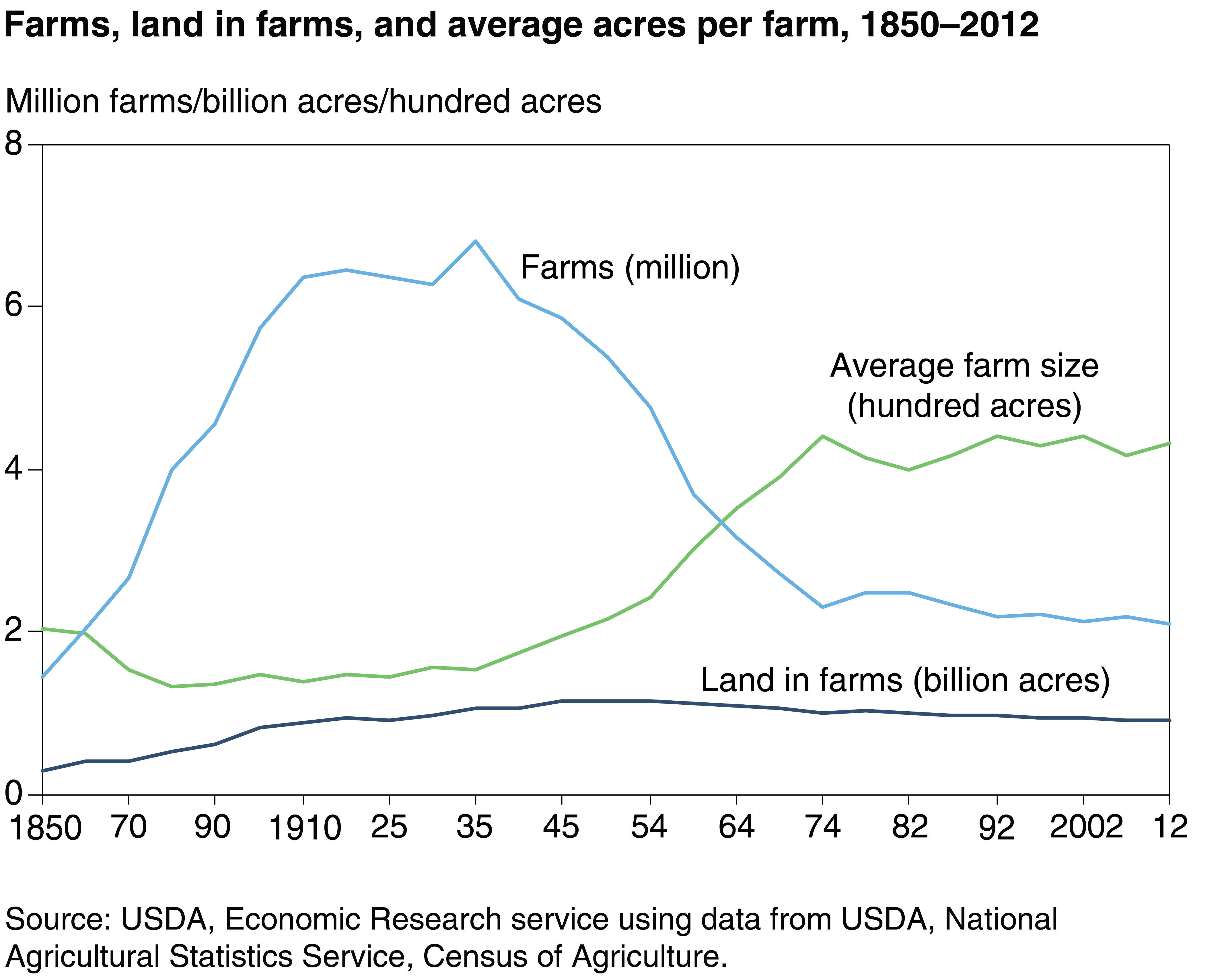 There were nearly 6.8 million farms in 1935, a number that has since fallen to roughly 2.1 million farms in 2012. Although farmland has declined slightly since 1935, it did not decline as significantly as the number of farms. Today’s farms are nearly three times as large, on average, as farms from 1935 (430 acres vs. 155 acres).
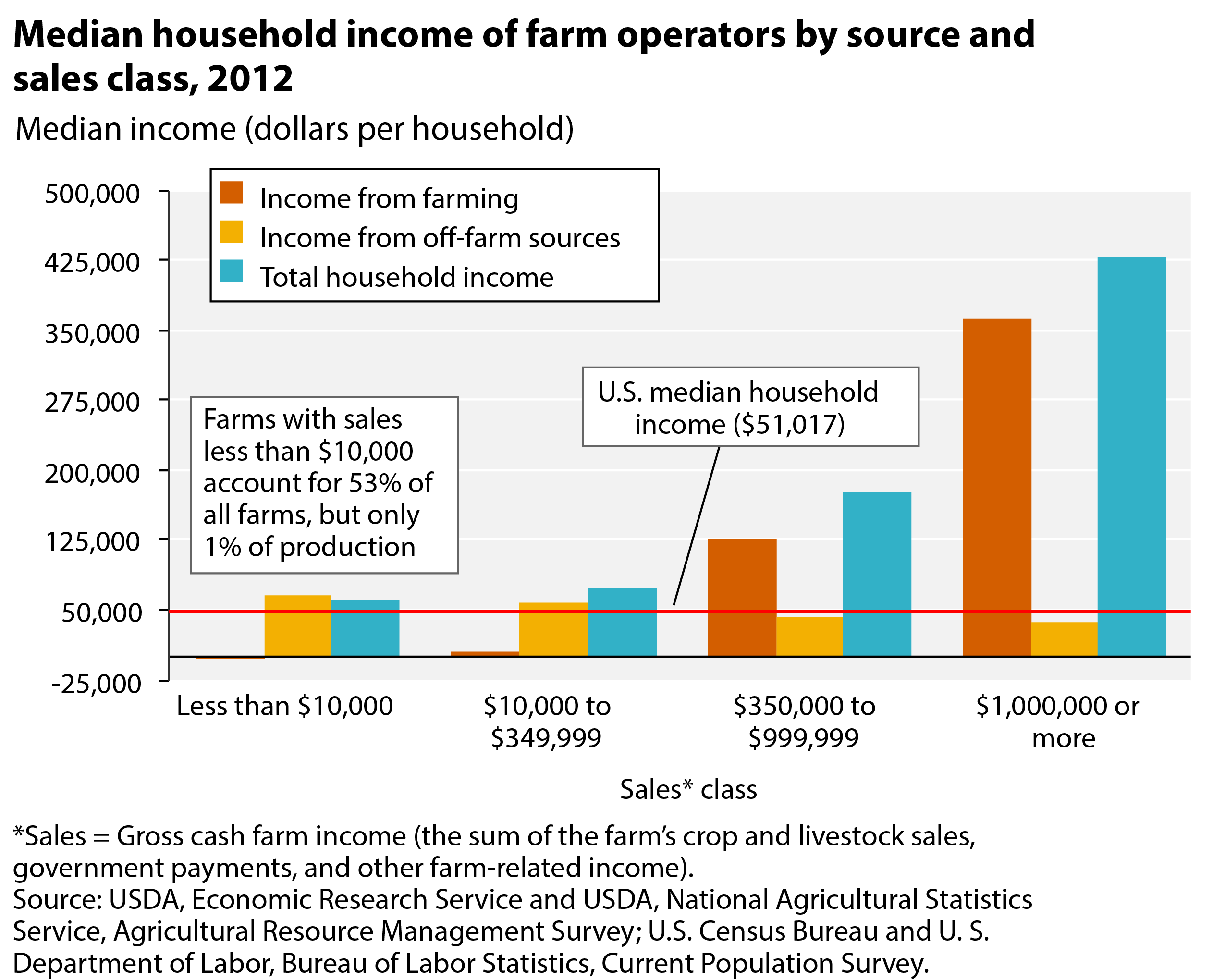 The majority of farms are very small, with annual sales less than $10,000. For these farmers, virtually all of their income comes from non-farm sources.
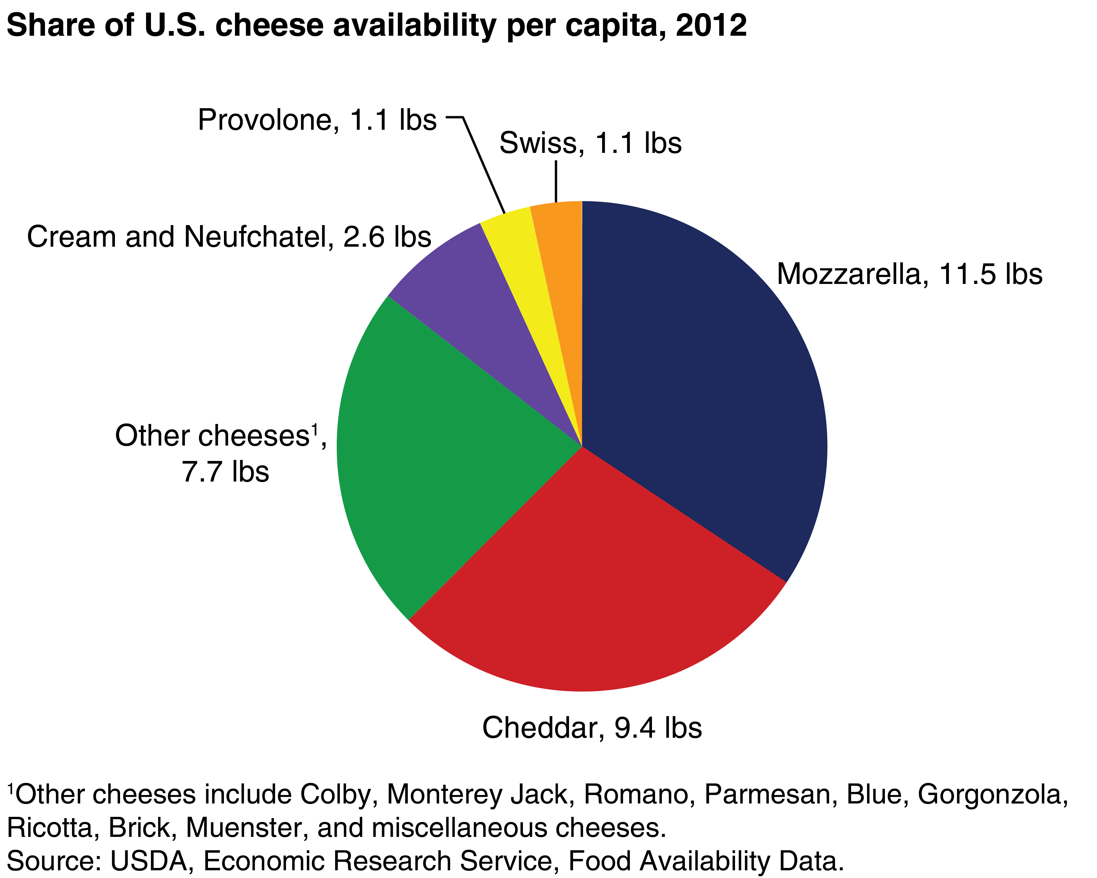 In 2012, there were 11.5 pounds of mozzarella available for every person in the United States (that’s a lot of pizza!). There was more mozzarella per person in 2012 than all cheeses combined in 1970. The USDA notes that the tremendous growth of cheese availability was due “to the spread of Italian and Mexican cuisines and to innovative, convenient packaging.”
Your support is critical to our mission of measuring, understanding, and predicting population change and its impact. Donate to Carolina Demography today.