The map below highlights population change and components of change for North Carolina counties between 2010 and 2014. The dark teal shows counties with population growth from both natural increase (more births than deaths) and net in migration. With few exceptions—such as Watauga in the northwestern portion of the state—these counties are located within metropolitan regions.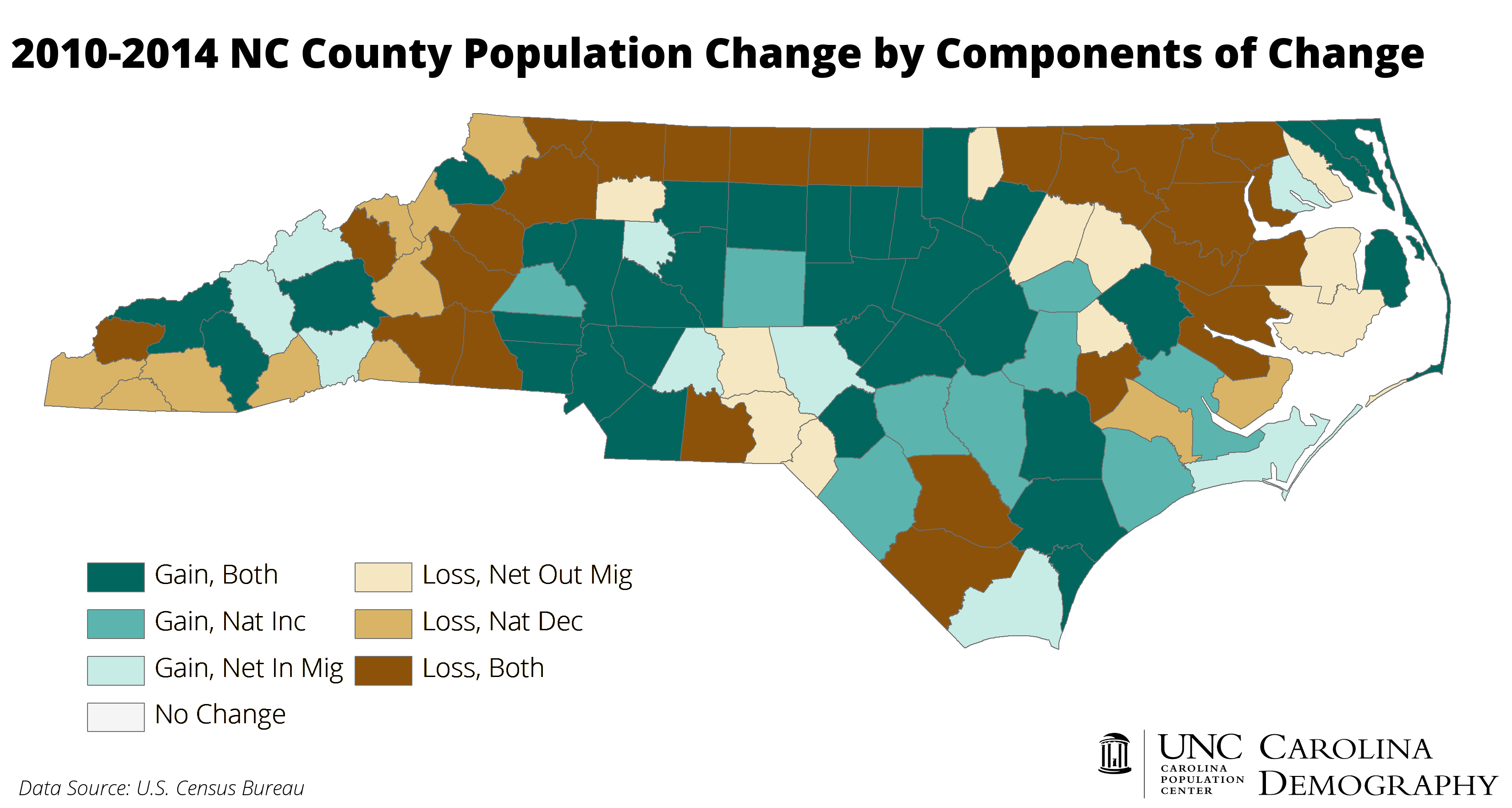
Counties with natural decrease, more deaths than births, are relatively older, and highlight rural/urban differences in the impacts of population aging on overall population growth. The light teal color shows places that grew between 2010 and 2014, but only because net migration counterbalanced natural decrease. These are predominantly retiree destination counties, such as Carteret, located on the beach or in the western portion of the state. (Although there are a few excpetions near metro areas in the Piedmont.) The medium tan/brown shows population losses driven solely by natural decrease; all of these counties are rural. The darkest brown, representing population loss from both processes, is also concentrated in rural regions.
For more about demographic processes and the components of population change, visit this post.
Your support is critical to our mission of measuring, understanding, and predicting population change and its impact. Donate to Carolina Demography today.