4 Amazing Interactive Maps
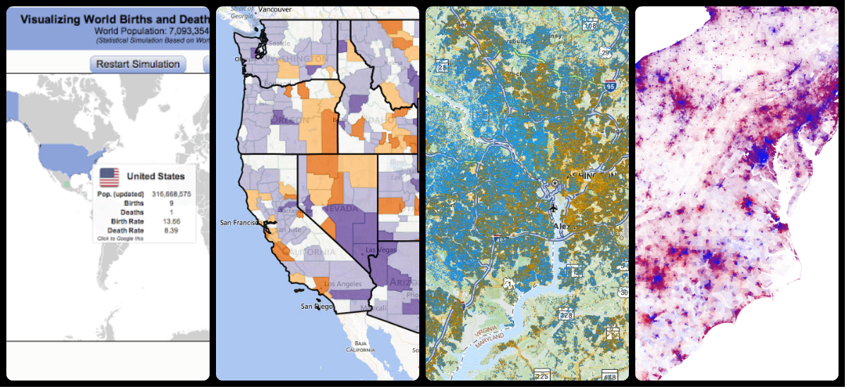
1. World Births and Deaths in Real-Time
Mathematician and software developer Brad Lyon previously developed a statistical simulation of the geographic location of US births and deaths and an interactive visualization that marked these events in real-time. Recently, he took the simulation and visualization global.
Worldwide, more than 4 births and nearly 2 deaths occur each second. Lyon uses country-specific data to simulate both the timing and location of global births and deaths. The interactive graphic shows each birth and death on the map as it occurs. Moving your mouse over a country brings up basic population statistics for that country and a summary of the current simulation.
Click on the image below to visit the Google Drive site hosting the simulation.
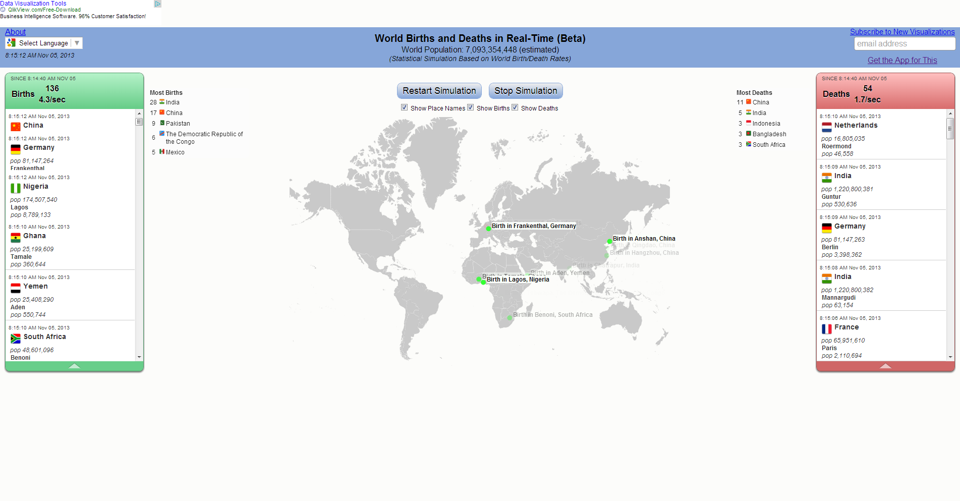
2. Sixty Years of U.S. Migration
Researchers at the University of Wisconsin, Michigan Technological University, and the University of New Hampshire have built a database that provides detailed county migration data for each decade since the 1950s:
Every year, about 10 million Americans move from one county to another. Migration rates vary by age, race, and ethnicity and with local and national social and economic conditions over time. Still, individual counties’ patterns of age-specific migration tend to be consistent over time telling demographic stories about local places. This website highlights these stories by providing reliable estimates of net migration broken down by age, race, Hispanic-origin, and sex for all U.S. counties each decade from 1950 to 2010.
On the website, you can easily make maps and charts to visualize migration patterns across space and over time. Or, you can download the underlying data. The map below shows the net migration rate of non-whites in the 1950s. Orange represents more people moving away from a county than moving in and purple shows the opposite. You can see clearly the impacts of the Great Migration, the large movement of African-Americans out of the South and into the cities in the North, Midwest, and West.
Net Migration Rate of Non-White Individuals, 1950-1960
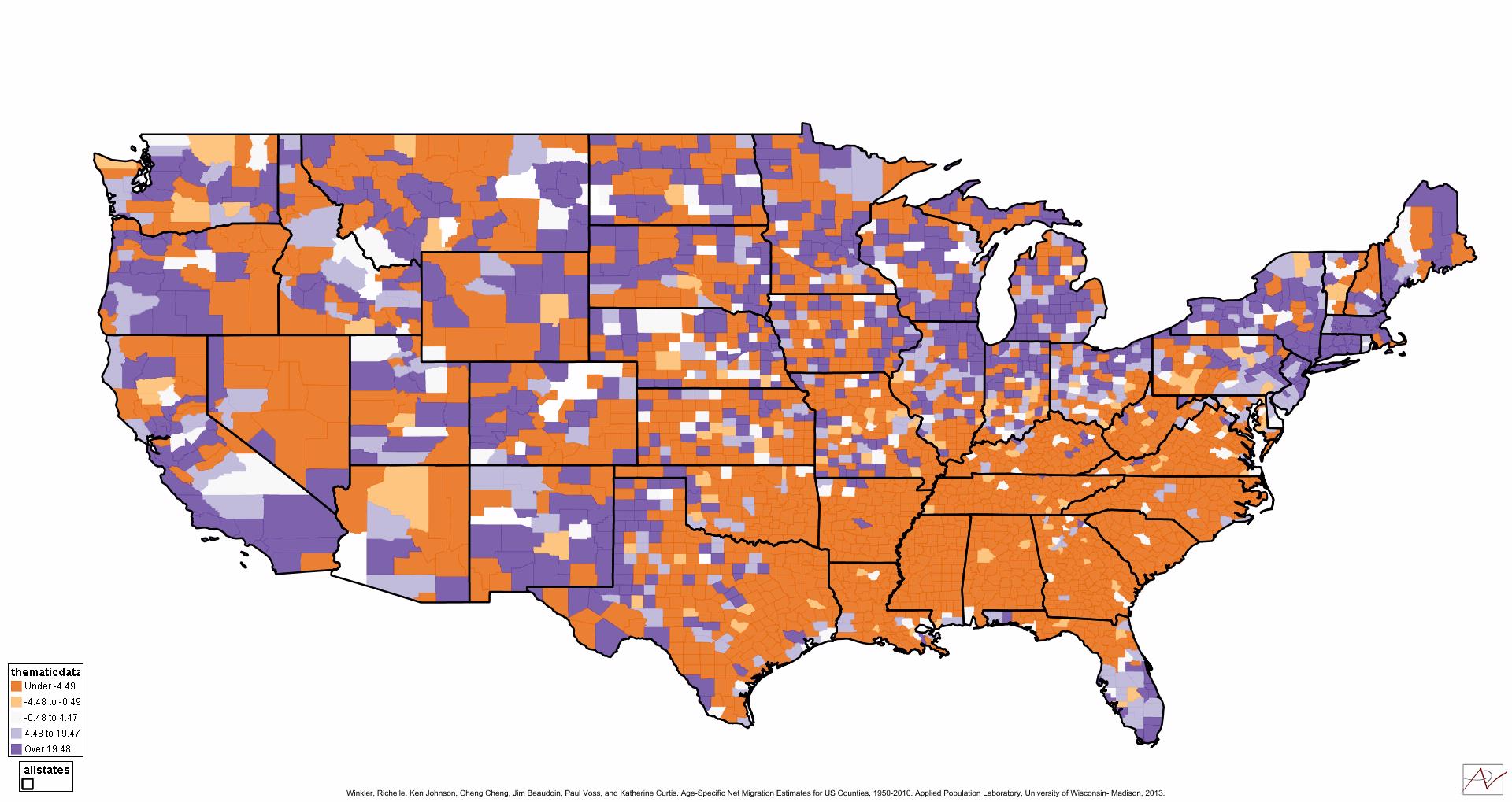
3. Synthetic Map of Every Household in America
Since 2007, researchers at RTI International, a Triangle-based research institute, have published a synthetic population database that represents each U.S. household with a geographic coordinate (latitude and longitude) and provides data on household income, size, and demographic characteristics (age, race, and sex) generated via computer modeling. The data have always been freely available and now they have a web-based mapping site that allows users to view household race, age, size, and income distributions for any location in the United States.
Bill Wheaton, director of RTI’s Geospatial Science and Technology Program, describes the Synthetic Population Viewer:
By representing each and every household as a point on the map, a wealth of complex patterns becomes apparent. In order to protect privacy, the interactive map doesn’t show actual households in their exact locations like Google Earth. Nonetheless, the data represent real households in reasonably accurate detail, enabling the map to show complex population distributions. It’s a rich tool for anyone interested in exploring the amazing diversity of human household populations in the U.S.
Note: While data are available for Alaska and Hawaii, the interactive map is currently limited to the 48 contiguous states.
A snapshot of household characteristics in the Triangle
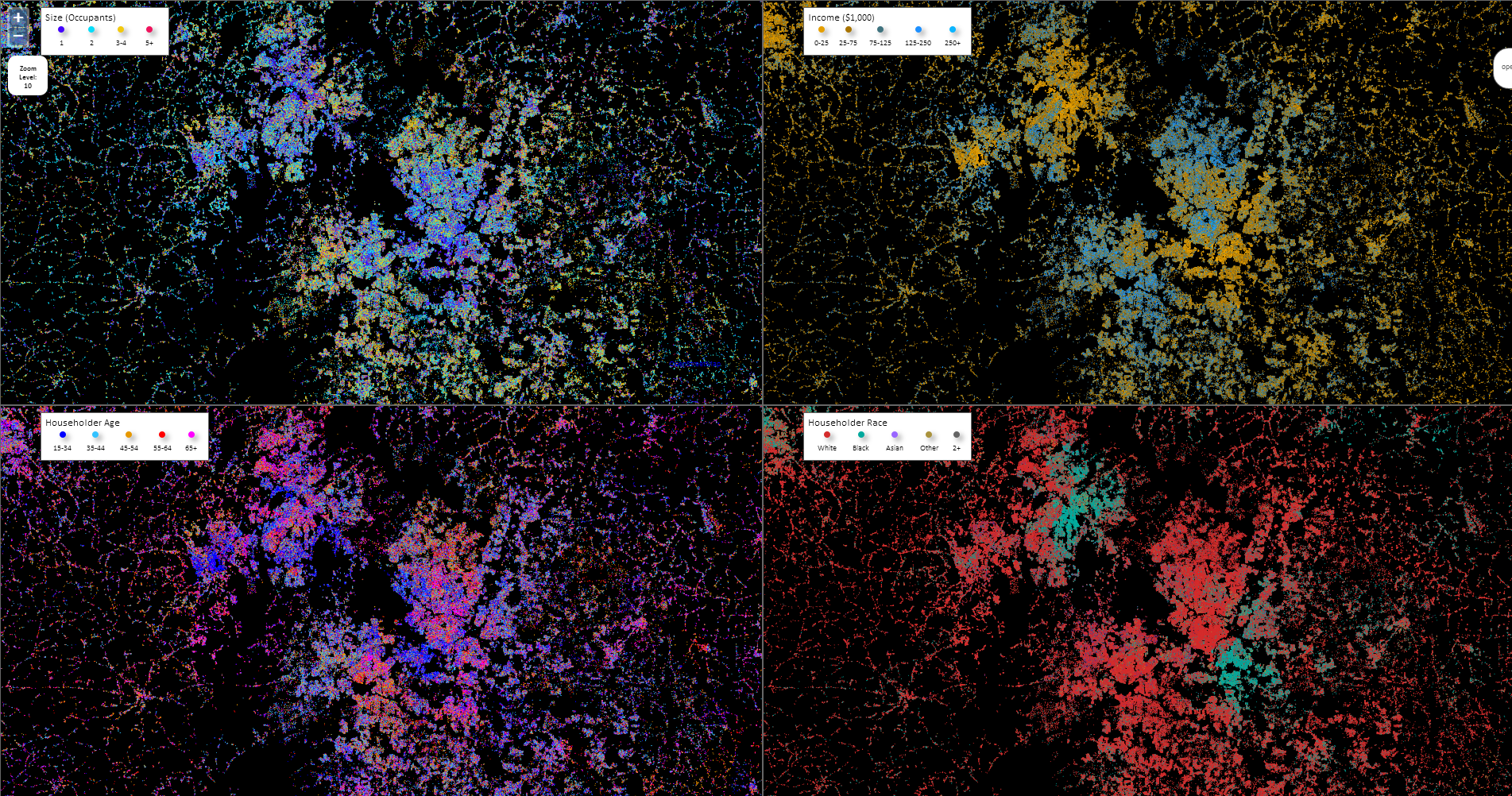
And last, an Election Day bonus:
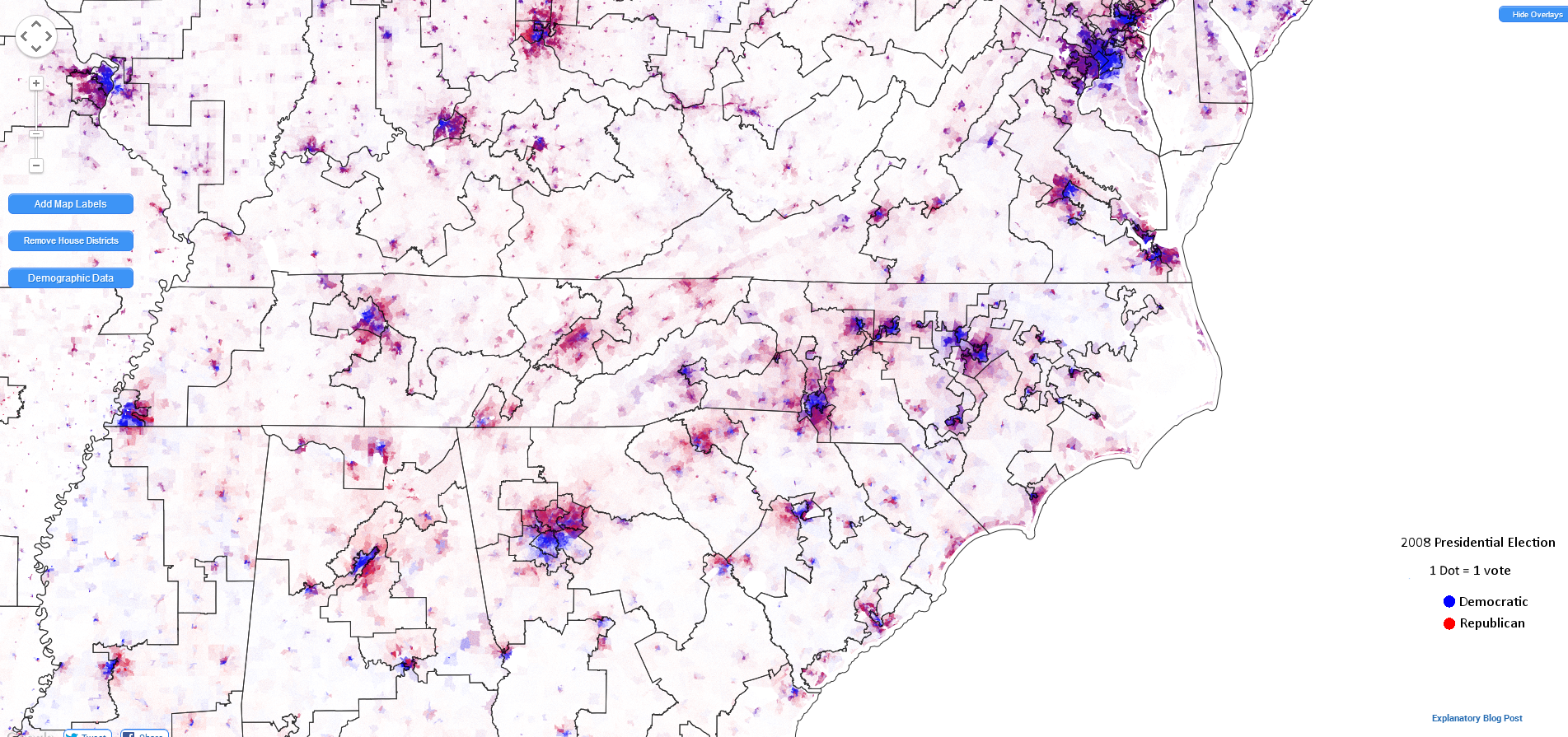
4. “A map that shows what’s wrong with Washington”
Dustin Cable, a researcher at the University of Virginia’s Weldon Cooper Center for Public Service, created the popular Racial Dot Map, with one dot per person (color-coded by race and ethnicity) for the entire United States. Now, Cable has added to this map 2008 presidential election data for every voting precinct in the country. Republican votes are colored red; Democratic votes are blue. Last, he overlaid current congressional district boundaries, to try to illuminate the “connection between redistricting, polarization, and legislative dysfunction.”
Click on the image below to visit the full Congressional Dot Map.
Your support is critical to our mission of measuring, understanding, and predicting population change and its impact. Donate to Carolina Demography today.